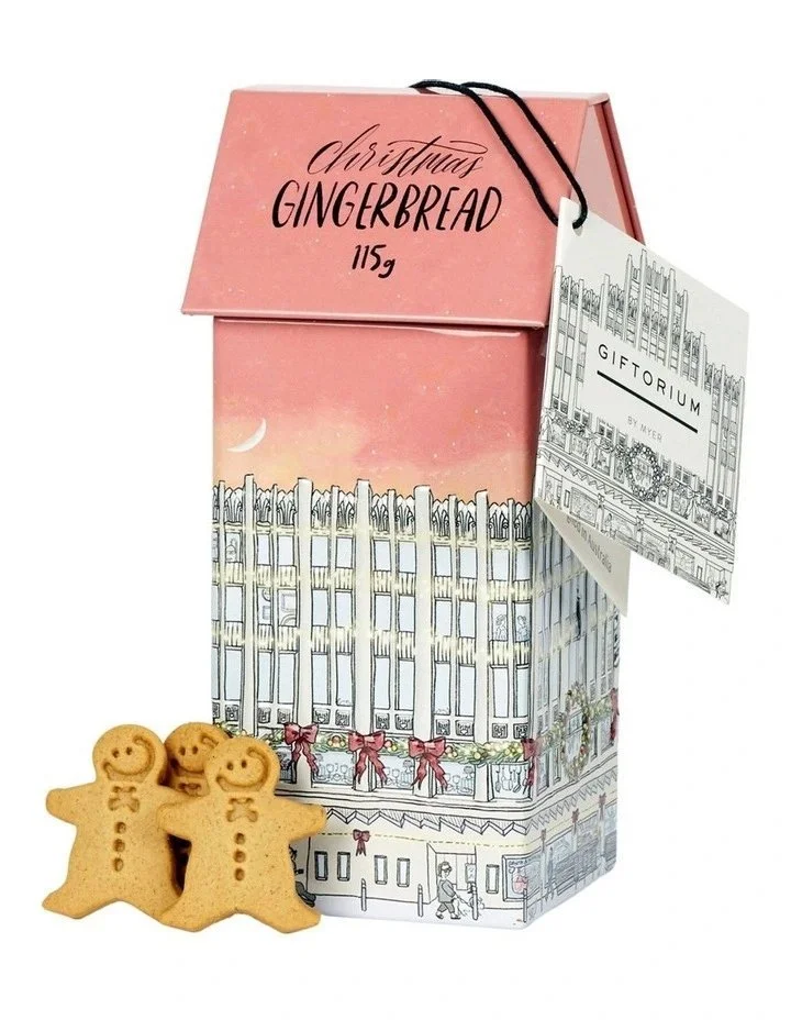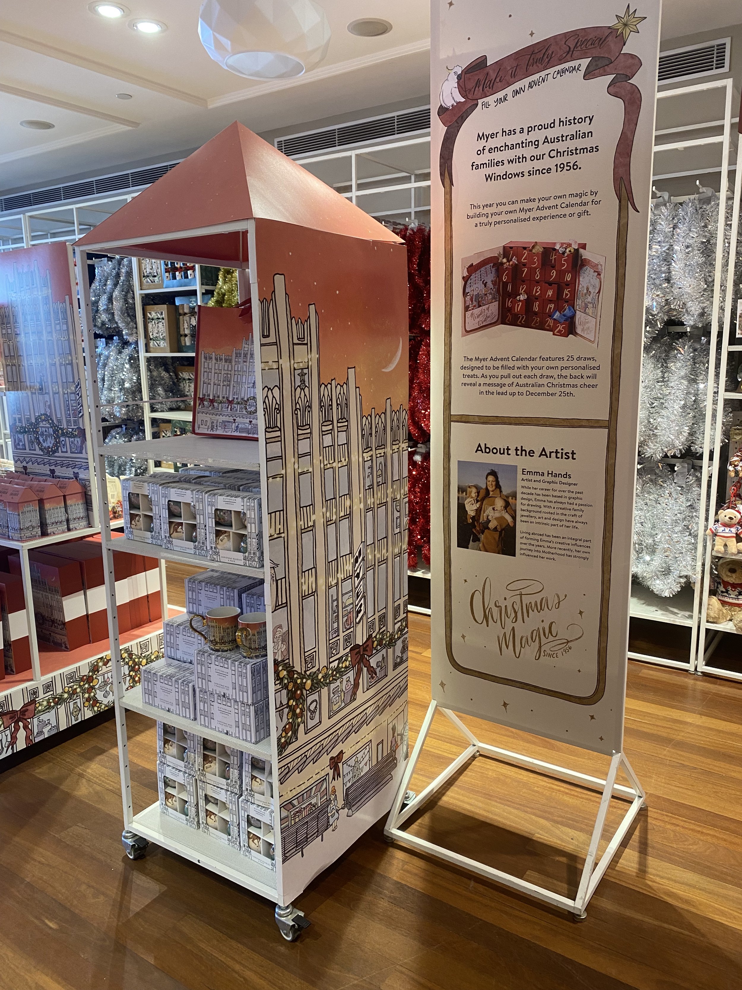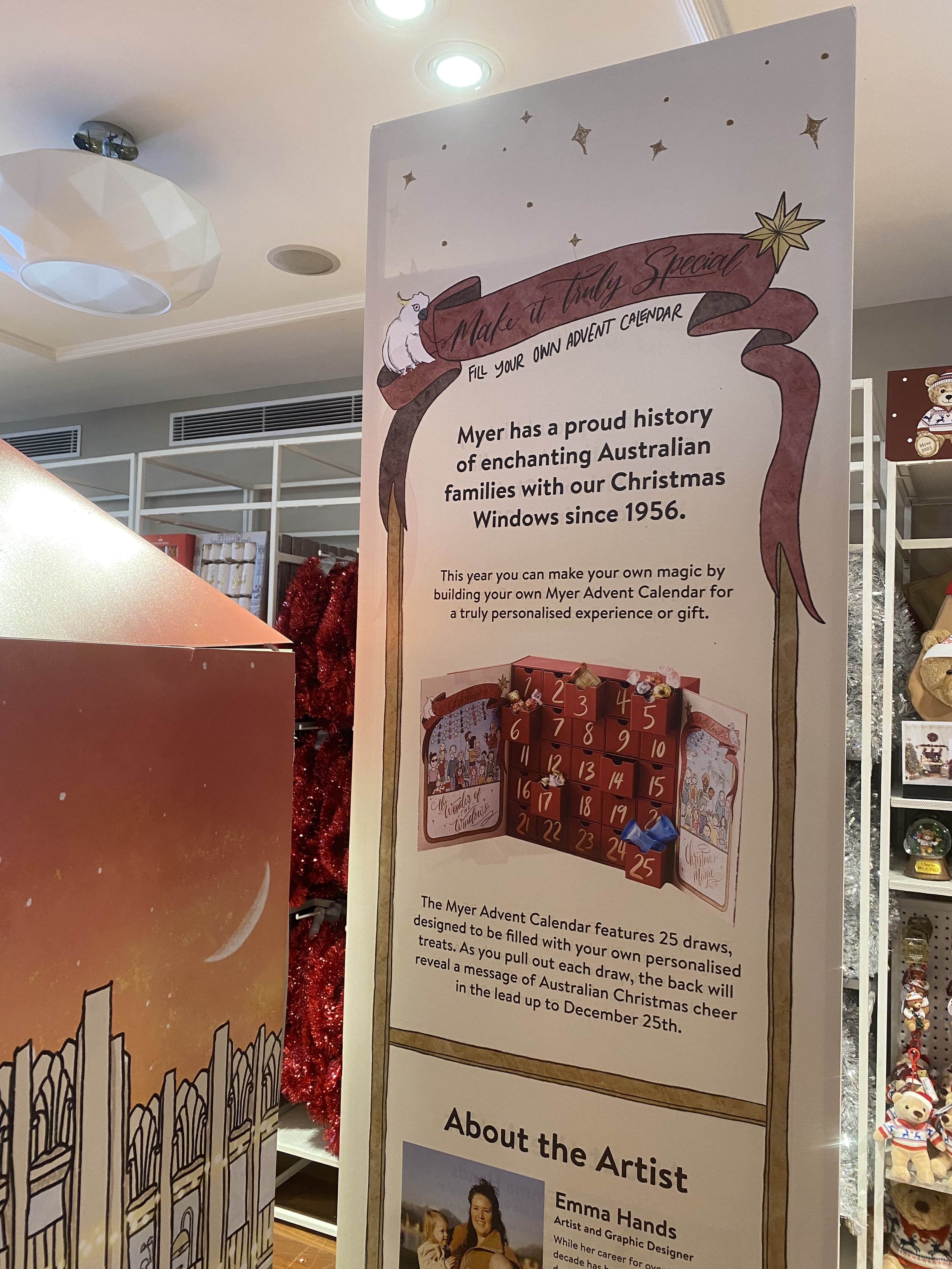
Illustration and layout for a “fill-your-own” advent calendar for MYER’s Giftorium 2023 range.
When you open the doors to the box, the illustrations reflect the many people who pass by the windows each year in the lead up to Christmas. With some little easter eggs (illustration easter eggs, that is) dotted throughout.
Each individual box has a gold embossed number and a little surprise on the back. Designed to be used year, after year.
The MYER illustration was rolled over to a tote bag, a two pack of mugs, musical gingerbread tin, Christmas baubles and packaging for the Giftorium Holiday range.
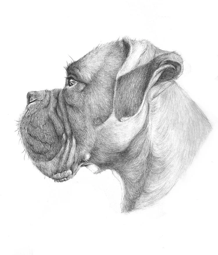
A range of illustrations completed over the years.
Drawing has always been my number one passion, and while I took time to be with my children, I craved to get back to my creative roots.
Through edX and The University of Newcastle, I completed the Drawing Nature, Science and Culture: Natural History Illustration 101.
1/2: A little illustration I completed when the world shut down, to call out my favourite small, local businesses and encourage people to support small!
2/2: A little illustration I completed when the world shut down, to call out my favourite small, local businesses and encourage people to support small!
My late Grandfather, Frank, who was a jeweller. He was a huge creative influence for me throughout my younger years.
I have completed numerous 100 days of drawing challenges, which I have always found inspiring and challenging. I learn to appreciate the beauty in the every day items surrounding me and find them the most inspiring.
Art print created for a fundraiser to help Australian Bushfire recovery.
1/2: Exploring character design, especially looking at smaller changes to facial features to see how it alters the character.
2/2: Exploring character design, especially looking at smaller changes to facial features to see how it alters the character.
1/3: A fun way to celebrate my kids birthday’s - create birthday illustrations for their invites.
2/3: A fun way to celebrate my kids birthday’s - create birthday illustrations for their invites.
3/3: A fun way to celebrate my kids birthday’s - create birthday illustrations for their invites.
Created for The West End, Vancouver BC, in celebration of Vancouver Pride 2023.
Art Direction and execution Ryleah Shae Creative
Design and illustration Emma Hands
Photography Robin Nuber
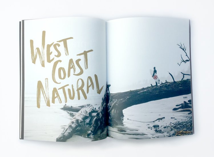
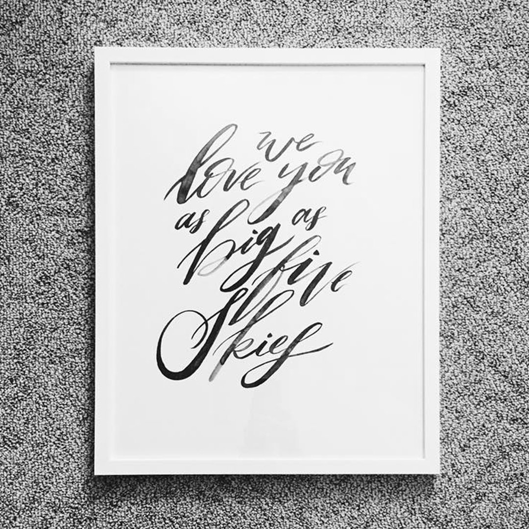
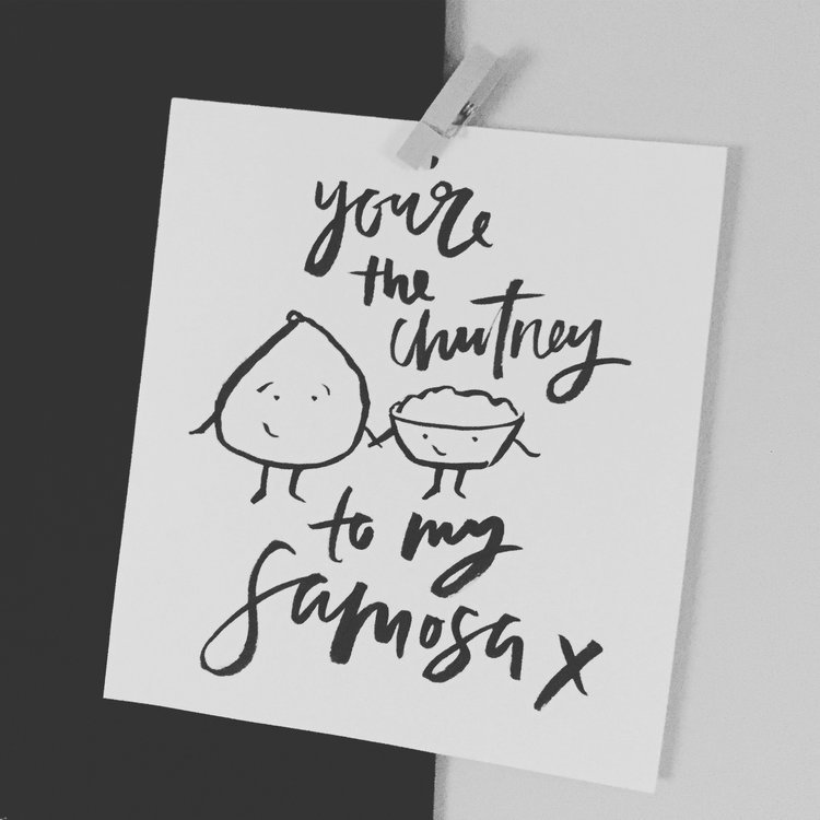
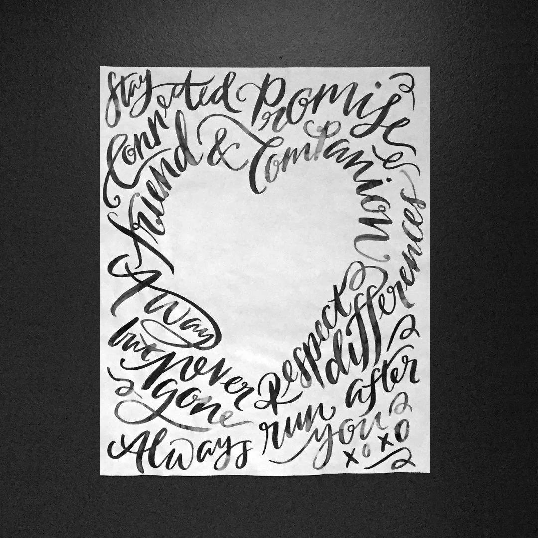
A selection of hand lettering pieces I have completed. A combination of personal projects, as well as commissioned pieces.
A fun little hand lettered piece I completed during my time at lululemon. It was used in an in-house publication, and later turned into a mural at a launch event.
When Rachel, of Two Loves Studio, came to me to help refresh her logo I was pumped! Rachel and I worked closely together to create a logo that captured her brand as well as her personality.
Follow Rachel on her website, social media or youtube channel.
I was approached by Meetup to create a hand lettered refresh for their Togetherfest. Ink on paper, which was then digitized for use.
Commissioned hand lettered piece.
A little hand lettered piece to celebrate 2021’s biggest project, my son, Vinnie.
A digital hand lettered celebration of 2019’s biggest project, my daughter Emilia.
While my husband and I don’t really subscribe to Valentine’s day, I still find myself creating little illustrations to celebrate our relationship.
A hand lettered piece for a wedding. It was used across multiple areas; including a light box and signage.
A hand lettered piece that the groom made into a sign for the wedding
Not one to shy away from a challenge, I decided to create tea towel wedding invitations for my wedding! Original design was created as a brush pen on paper, digitized and screen printed onto tea towels.
Save the date, and patterns created for my wedding. The patterns were used at the wedding (on napkins I had screen printed). Original design was all ink on paper.
Brush and ink on paper.
Commissioned brush lettered piece, for a wedding gift.
Commissioned hand lettered piece.
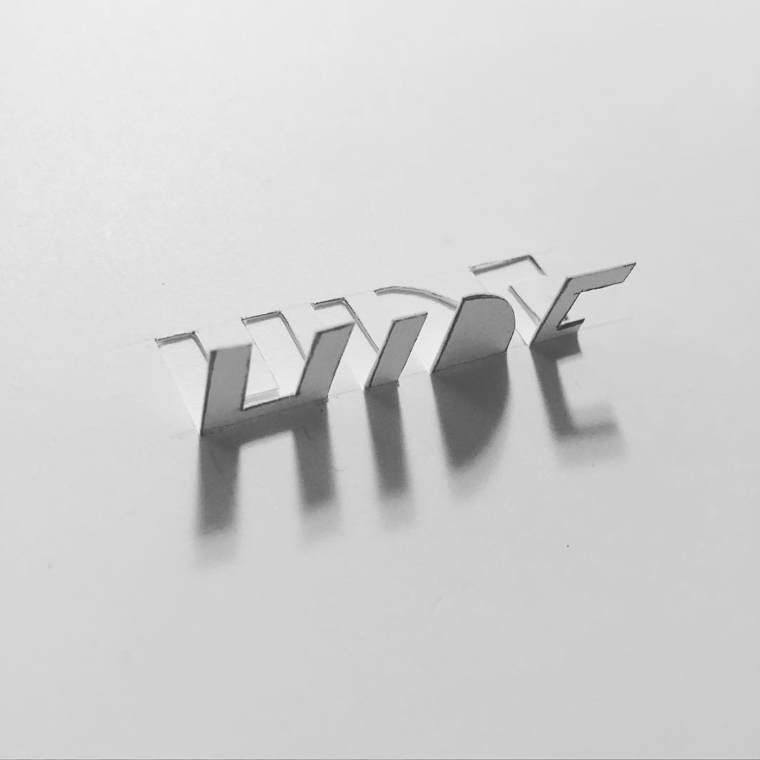
Playing with cut paper and shadow. The is so much beauty in stepping away from the computer and making something with your hands.
Playing with brush and ink, followed by digitizing and recolouring.
Brush lettering, overlayed on an image. I love the inky texture you get with brush and ink on paper.
Playing with lettering away from the brush!
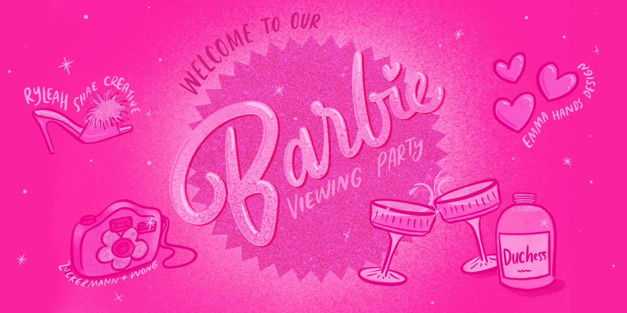
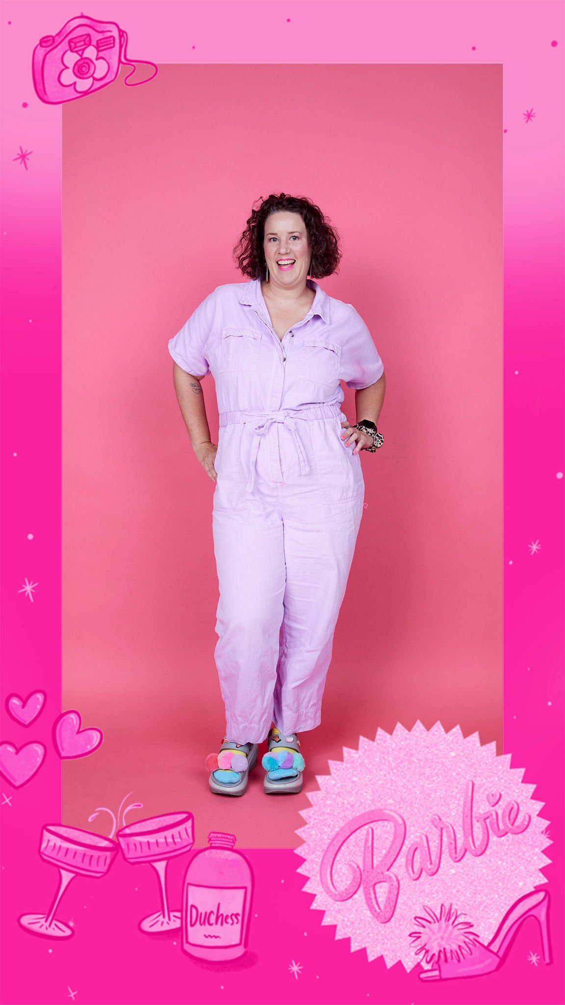
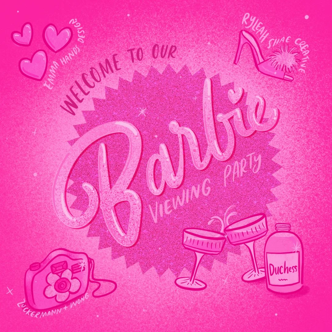
When Ryleah Shae Creative approached me to help bring her idea of a Barbie Viewing Party, it was a “hell yes!” from me. Inspired by the Barbie buzz, Ryleah approached other small business to bring this viewing party to life.
I created instagram graphics, theatre light box imagery, an animated graphic that was displayed on the big screen at the beginning of the show, a digital “Barbie Box” that was used by photographers Zuckermann & Wong, and a sticker sheet that was given out to VIP attendees.
Tough Titties is my third baby, that I have built up over a number of years (especially after my kids were born and I was feeling the need to create).
My product focuses on creating empowering feminist designs with a touch of humour. Tough Titties is a brand that reaches a broad range of customers; from mothers, to breast cancer survivors and everyone in between!
The designs make people smile, laugh, “Hey! Look! These are my boobs!” It makes people feel seen and normalizes all the wonderful, misshaped, mismatched boobs and scars that are out there.
In the years I have been working on Tough Titties, I have learnt that the designs are able to transcend gender, race and beliefs, and connect people on an emotional level. To have a brand that connects so many people, and gives back to the community, is truly special.
Design // Emma Hands, Laurel Richardson
Art Direction // Bev Wong
We wanted to take the humble lululemon shopper and transform it beyond the use of a lunch bag. So, for holiday 2015, that’s what we did!
We had the vision of designing a shopper that could could roll down, so that our guest could use in their own homes, or office, to store fruit, books, plants...the possibilities are endless!
Similar to the iconic ‘manifesto’ lululemon shoppers, we created a large and small shopper design. The shoppers are constructed with a heavy duty polypropylene material, which is perfect for rainy Vancouver weather!
Design // Emma Hands, Tierney Milne
Art Direction // Bev Wong
Photography // Miles Clark
Copy // Tyler Jones
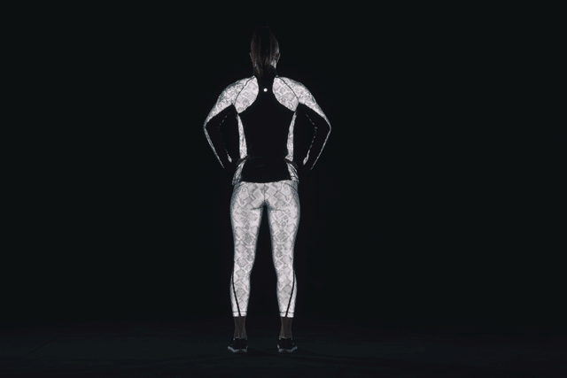
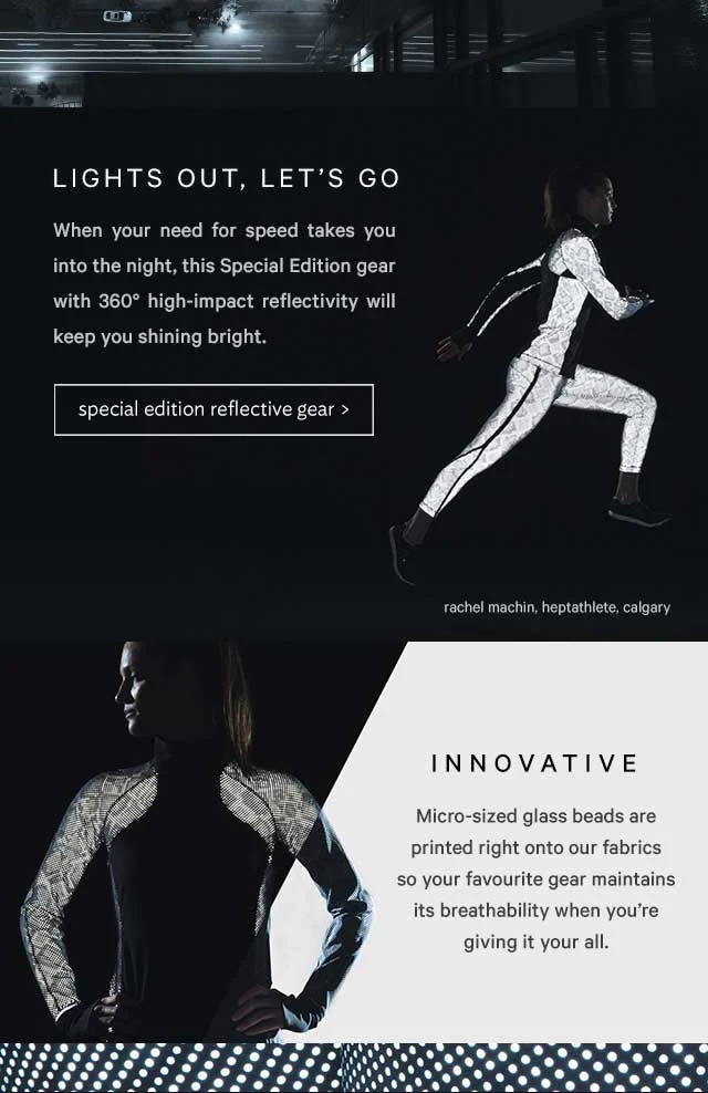
For 2015 Black Friday, lululemon released a special edition product line that featured 360-degree reflectivity “Ravishing Reptile” design, to keep you safe during dark cold-weather runs.
Work on the project included product hangtags and digital assets that appeared on the website, social media, and lululemon’s weekly email.
The digital campaign highlighted the technical features of the product, as well as making running in the dark look bad-ass.
As designer, I worked with the AD on the hang tags (concept through to final art), as well as concepts and design support with digital assets. The hangtag included a reflective tie, that is intended to be used as a hair-tie, for added safety on runs.
Designer/Art Direction // Emma Hands
Art Direction // Bev Wong, Usha Wennerstrand
Store Designer // Lisa Ewing
lululemon’s first store opened on W4th, in Kitsilano, in 2000. In the works for a number of years, the new store was a collaboration between a number of departments. With a strong vision from the Store Designer, we created a store that celebrated the company’s past, and highlighted its bright future.
Project work included:
Building a visual language that was used throughout the project. The document was constantly updated and kept the store vision on top of mind at all times
Pattern design for the concrete panels on the store front. From concept to final art and working with the concrete vendor
Pattern extended to concrete floor, engraved on women’s floor
Design of the repurposed Midas sign
“Love notes” that were stamped into the concrete in Women’s store, and in fit rooms
Inspiring phrases that appear in the stairwell to rooftop
Brass plaque design(s)
Concept and design of men’s community wall
Identifying artists and working with them to create murals (exterior and interior stair well)
Interactive artwork that celebrated company history
Media feature // Business Vancouver, Canadian Running Magazine, Daily Hive,
Design // Emma Hands
Art Direction // Bev Wong
lululemon Flatiron is a flagship store that is over 16,000 sq ft, making it the company’s largest store. Split over two levels, it features a community concierge and a multipurpose community space called Hub Seventeen.
The project included many different elements;
A pattern that was used throughout the project and applied to the Flatiron logo, vestibule screen (at entrance of store) and cash art. These elements were worked on from concept through to final production.
Concierge collateral; including business cards, postcards, note cards, custom wrapping paper and gift box.
Hub Seventeen logo.
Sourcing a local artist, and working with them to create artwork for Hub Seventeen space. This artwork was also applied to limited edition product.
Working with AD and Visual Merchandise team to determine store props.
Media Feature // Business Insider, Racked.
Project included designing the awning for the newly renovated lululemon Santa Monica store, along with store re-opening invites.
The awning was designed with a repeat pattern, that included words that are strongly tied to the lululemon culture. It is designed in such a way, that the awning's shadow projects the words on the facade of the building.
Design // Emma Hands
Store Designer // Diana Stevenson-Moore
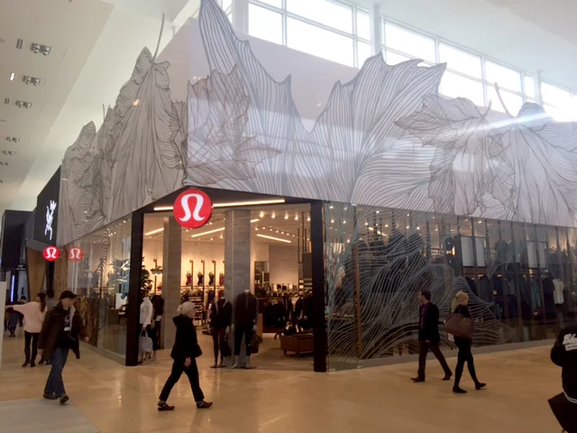
A larger-than-life leaf pattern for lululemon Yorkdale's new store front. It involved working closely with the Store Designer to understand her vision for the store.
The project also included working closely with print vendors to ensure the smooth application of the design onto the store front.